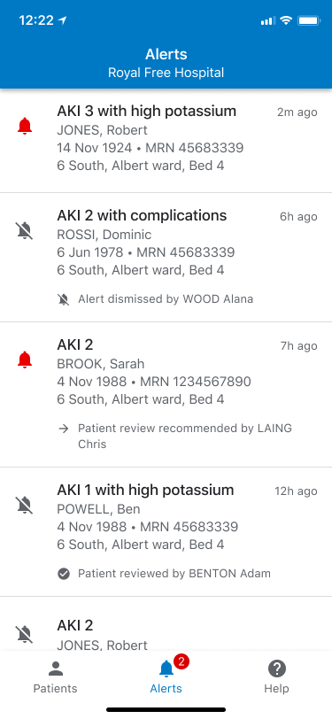
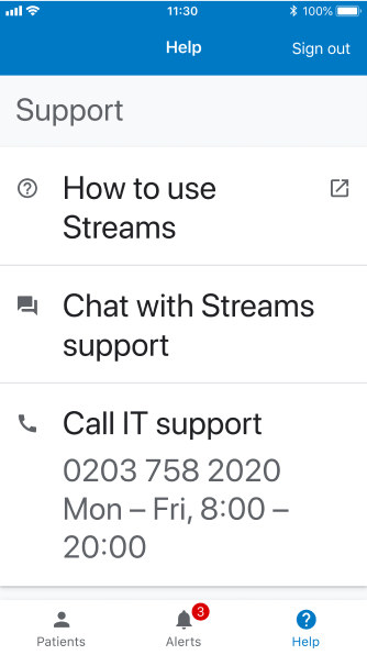
Streams is an iOS application for doctors and nurses in the UK. It sends alerts for patients at risk of an Acute Kidney Injury and allows easy viewing of patient health record data.
At the start of 2018, I worked on a redesign of Streams using Material Design in preparation to scale the product to new markets. My team did an audit of the existing UI to see what to replace with a pre-existing Material component, and what new components we needed to build ourselves to deliver the full experience. We extended Material design with a handful of custom components and patterns, which I will share below.
Before
After
The redesigned interface is intended to be bright, clear, and follow the Material Design language.
Before
After
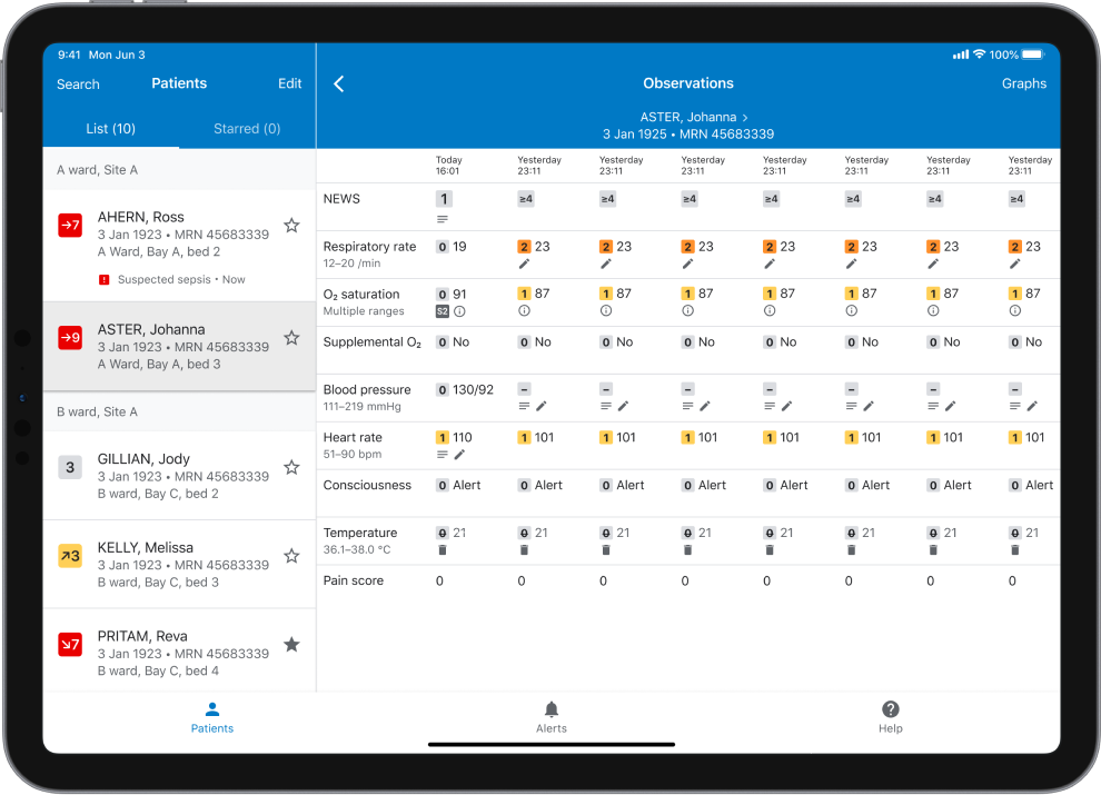
Accessibility was at the forefront of the redesign. We aligned all content with two keylines, which resulted in improved legibility and avoided eye movement from left to the right of the screen when scanning. The content was also commonly grouped by a leading icon or badge.
Before
After
The two-keyline layout also made it easy to support resizable text sizes. And finally, we rewrote all of the UI copy to be succinct and adhere to an established tone of voice.
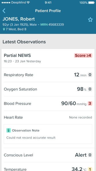
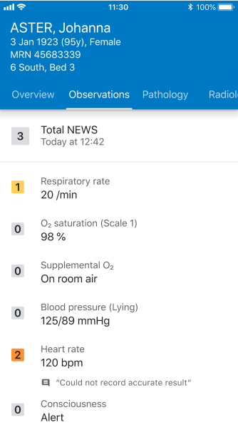
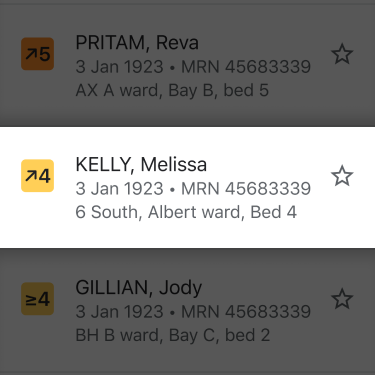
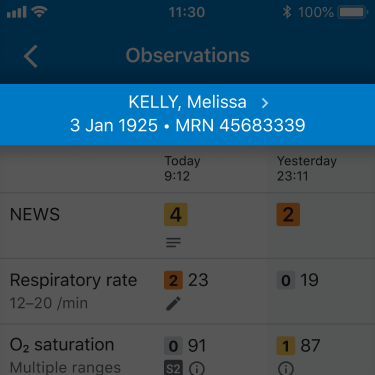
For the bespoke components created, we put together specs outlining their layout and behavior. Below is an example of a NEWS (National Early Warning Score) badge. NEWS is a numerical indicator of how ill a patient is, based on their vital signs. The higher, the worse.
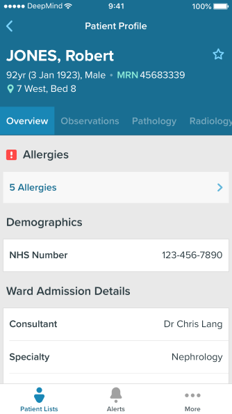
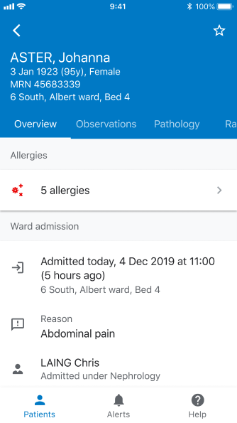
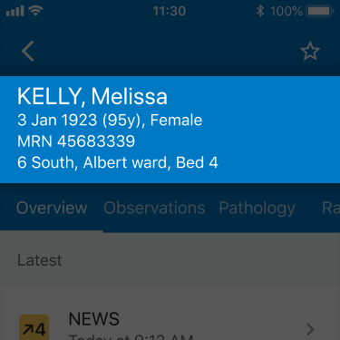
Another pattern in Streams is for patient identification. At a glance, we show a lot of identifiers: Surname, first name, date of birth, age, Medical Record Number, and location. These are necessary to positively identify a patient. Once the user finds the intended patient and browses through the record, we reduce the set of identifiers.
I also created several prototypes, such as this note attachment viewer prototype built using SwiftUI.
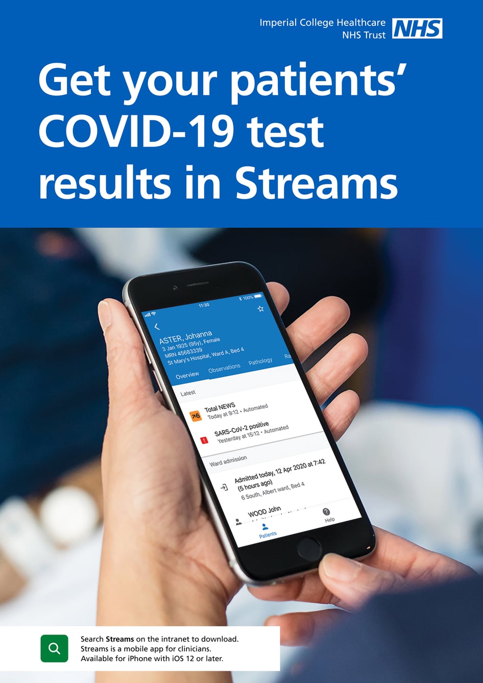
In June of 2020, we released a new feature in Streams to display Covid-19 patient test results. To spread awareness, we made this for the Imperial College Healthcare NHS Trust at launch.
I’m incredibly proud of all the work I’ve done at Streams and for the NHS while working for DeepMind Health and Google. And hope to share in the future about my work at Google Health.
Currency is a simple currency conversion app for iPhone.
A side-project to learn iOS development. Designed and developed by myself over the course of two months.
After using various currency conversion apps for iOS, I found most of them to be complex, unintuitive, or out of date. Most of the time they’ll have walkthroughs, unnecessary navigation, or too many options. I designed Currency to be the simplest and most intuitive currency converter in the App Store.
Goals: 1. Very quick to use 2. Designed for travellers 3. No walkthroughs
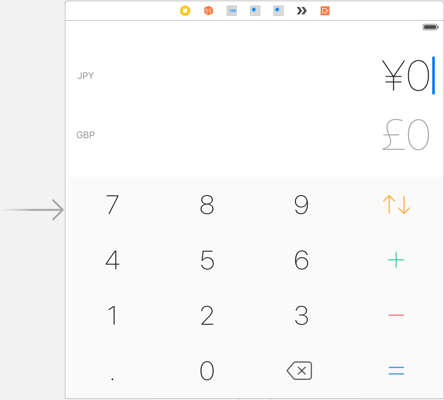
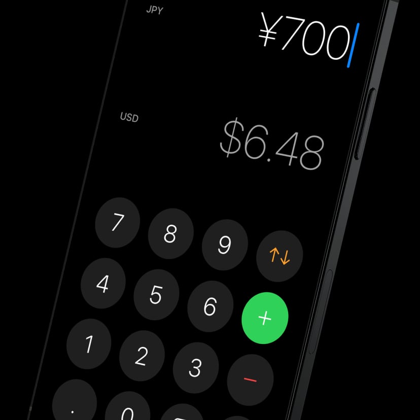
One of the most unique aspects of Currency is how the numbers are formatted. They have the correct currency symbol, number of decimal places, decimal divider, and group dividers. This makes the number look exactly how you’d see it in a store or market while traveling.
The final design focuses on doing one job well: converting a foreign currency into the customer’s home currency. Features such as currency fluctuation graphs, in-app settings and notifications were not necessary for this job.
The icon is designed to fit perfectly with iOS, presenting Currency as if it is part of the operating system.
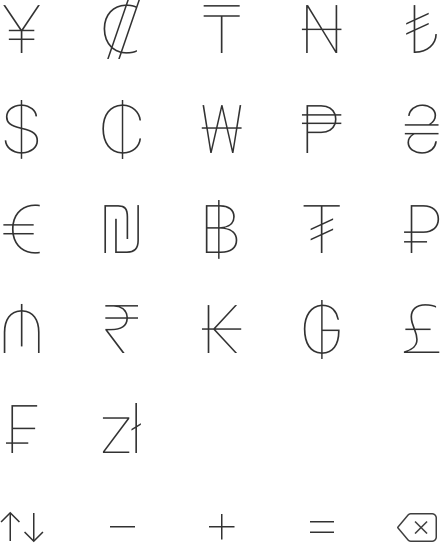
Most currency apps use country flags to illustrate different currencies. Yet, as some currencies like Bitcoin or the Euro don’t belong to a specific country, I opted for using currency codes instead.
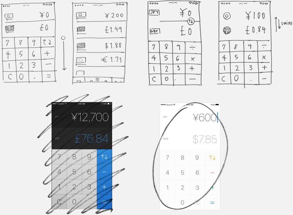
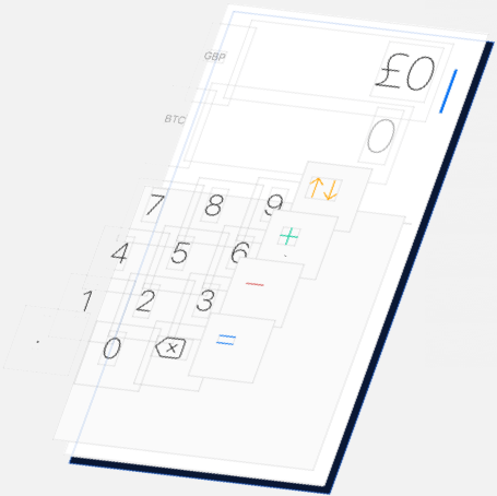
In the early sketches I was working out how to select a currency and swap input currencies. The first visual design direction had a blue and dark visual style that I moved away from. While asking for feedback, people seemed confused about which number they were editing so I added a text input blinking cursor.
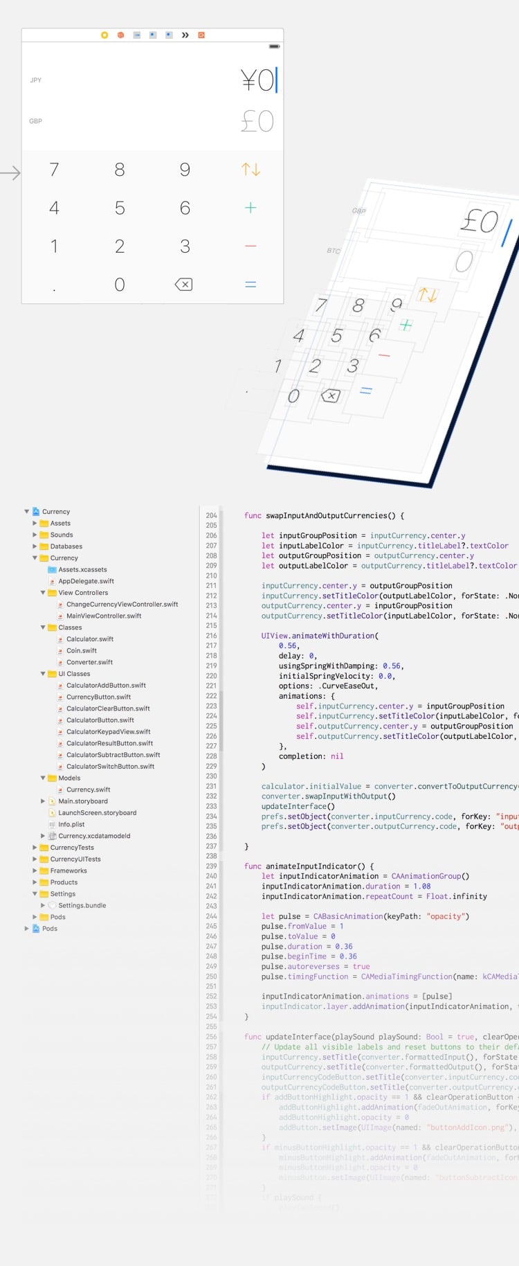
The final design is bright and shows activity indicators when the currency exchange rates are being updated. After receiving more feedback and feature requests, I added more options to the app settings in the iOS Settings app.
This was the first app I developed for iOS, and my first time writing Swift. Learning how to develop for iOS was a personal goal for years. I learned by reading Beginning iOS Development in Swift by Apress, and with some help from friends like Jonathon Toon and Tiago Alves.
You can see the source code for the first version on GitHub.
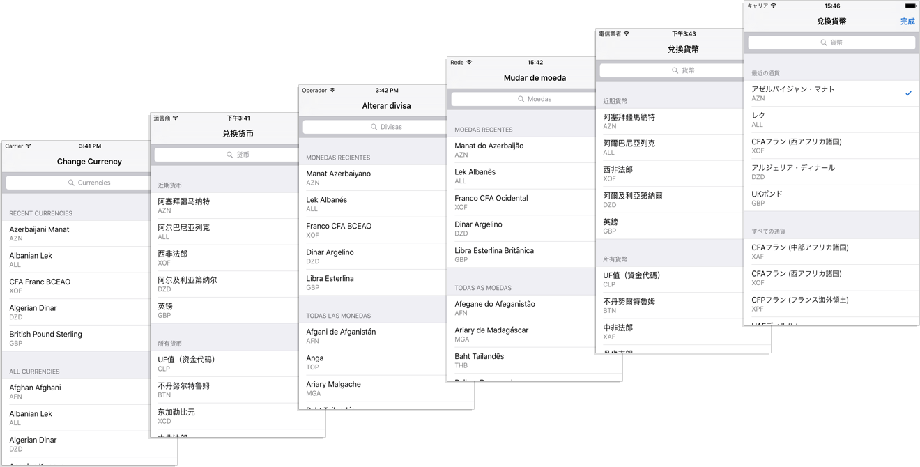
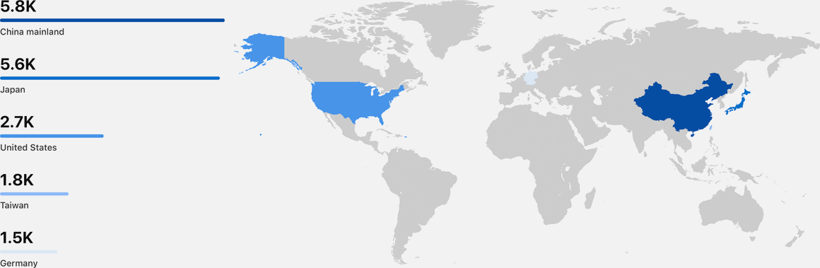
The application, website, and marketing material is localized to the US, the UK, Japan, China, Hong Kong, Taiwan, Latin America, Spain, and Portugal. A year after release, 76% of the downloads are from users in the Asia/Pacific region.
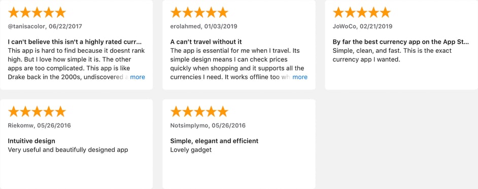
Four years after release, Currency has been downloaded over 28,000 times and has an average rating of 4.6 stars on the App Store.
I continue updating Currency to make use of the latest technologies and advancemets in iOS. You can download it for $0.99 or equivalent from the App Store.
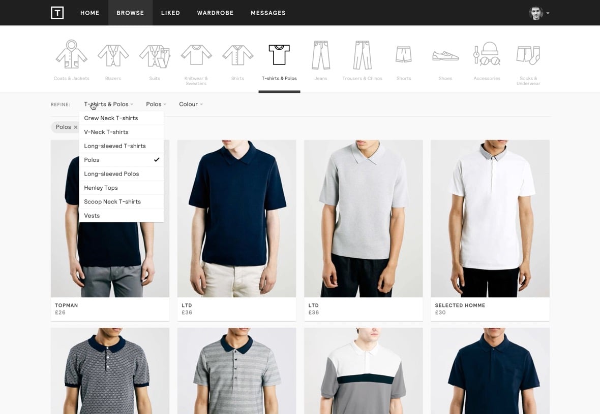
Thread offers one-to-one personal styling and a powerful clothing recommendation engine.
Thread is an online styling service, currently only for men in the UK. It brings together fashion stylists and machine learning to give users high-quality personal styling for free. Thread is a YC’11 start-up founded by Kieran O’Neill, Benjamin Phillips, and Ben Kucsan.
Challenge: How might we improve our mobile experience?
Despite most users completing an order via the desktop browser, the vast majority of Thread usage comes from mobile browsers. Me and Ben K put a focus on the mobile experience and started work on a native mobile experience in order to push up orders on mobile platforms.
Moving our product from being a desktop-first website to a mobile-first native application led us to re-architecture the user interface.
We developed a new design system for Thread called Thread Whitechapel. This design system included new type styles, new touch interactions, new guidelines for flows and page content, and a new set of components. This resulted not only in a better mobile experience, but it also allowed us to design and develop faster while keeping our visual language consistent.
Challenge: How might we provide a thread service while stylists are away?
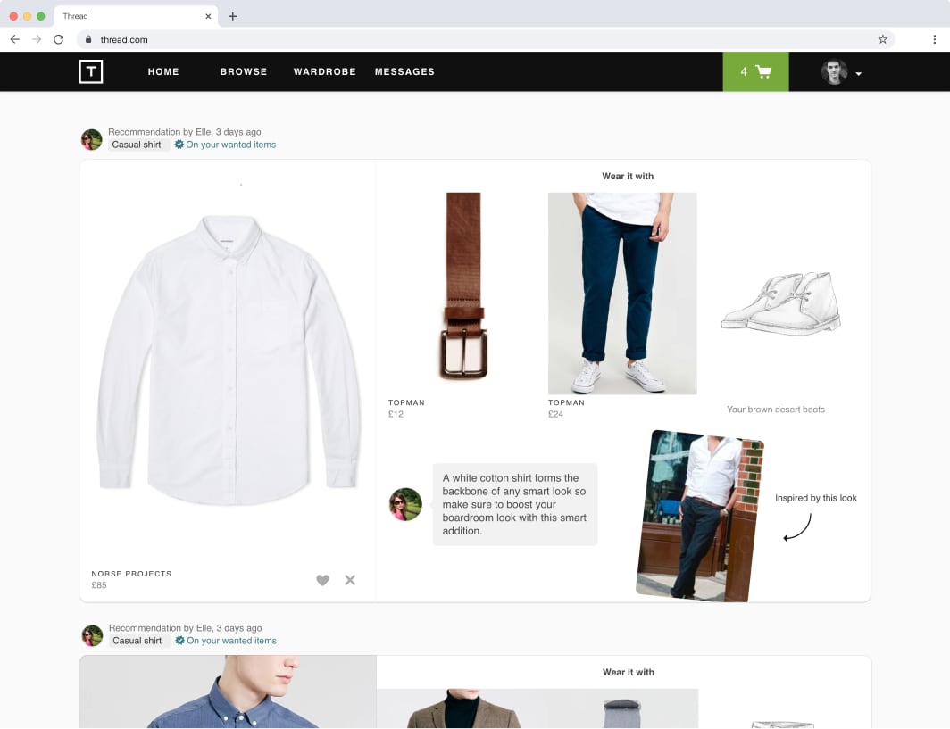
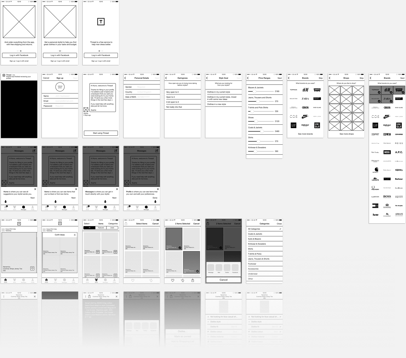
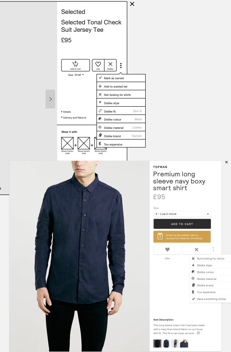
Thread has a powerful recommendation engine that finely tunes the outfits each stylist creates to each user’s budget, preference of material, brand, skin color, body shape, and many other factors.
The personal touch is what makes Thread unique, and that is the core of the product. But when stylists are away, the activity stops. How might we deliver some of the power of that very personal recommendation even when stylists are not available?
We wanted an experience similar to walking to a clothing store and seeing only new items that you would love. This became Thread Browse.
We went beyond just creating an online store. We created a browse experience, but out-of-the-box this gives the user personalized item recommendations, in stock, available on their size and within budget.
Thread has been growing steadily over the last few years and I’m incredibly proud of all the work we have done together. If you’re interested in working at Thread, see their jobs page. If you’d like to sign up, go to thread.com.
Other projects involve work on branding, photography, illustration, and software development.
One of my most popular side-projects. A travel blog where I documented my experience traveling completely on my own in a country where I didn’t speak the language. All photos taken with a Fuji X100. See the story here.
ustwo brand
The ustwo brand design is inspired by the candid and daring company culture. This included a new logo, website design, typeface, and tone of voice. See it here.